Brand Guidelines, Also called a brand style guide, are essentially an instruction manual and rule book on how to communicate your brand. The goal of brand guidelines is to protect the strength of your brand so that it continues to create value for your company. Brand guidelines achieve this by explaining the importance of your brand identity and describing how to use the elements of the brand.
For some inspiration, we’ve pooled together the 17 famous brand Guidelines template examples that inspire you to create your next one.
1.Carrefour
Carrefour operates supermarkets, hypermarkets, cash and carries stores, and e-commerce websites. The Company offers consumer goods, food and non-food products, household supplies, textiles, electronics, home appliances, and local products. Carrefour serves customers worldwide
Carrefour brand guidelines is an extended Guide containing 71 pages. It guides you clearly on how to use Logo, Backgrounds, Logo positioning, Image style.
Typography, Tone of voice, Banner applications...etc.
the style guide of carrefour is very straightforward. The focus of the brand identity is the red and blue logo. Check out the magic Here
2.Spotify
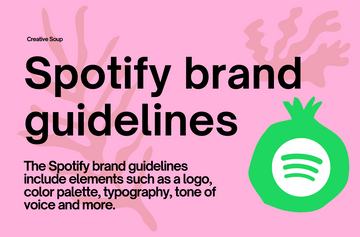
Spotify is a digital music, podcast, and video service that gives you access to millions of songs and other content from creators all over the world. Basic functions such as playing music are totally free.These guidelines have been developed to ensure that all Spotify users receive the same delightful user experience - no matter which platform they listen to.
It’s a good idea to design a style guide that's easy to read and navigate. Spotify branding guidelines capture their style specifications in a simple and structured format. The guide features Spotify logo, colors, naming restrictions, and Fonts. take a look Here
3.Facebook
Facebook is a social networking site that makes it easy for you to connect and share with family and friends online.
This Brand Guidelines outline the rules for using the Facebook app’s brand assets and showcasing Facebook app Product content. Check out their guide via their website here.
4.Apple
The Apple identity is a seal of approval and a promise of excellence. When you are authorized or certified in your area of business or expertise, you also represent Apple. By following these guidelines, you reap the benefits of the Apple identity and contribute to its strength.
The book contain 56 pages includes Minimum Clear Space and Minimum Size, Typography, Do don't, and more! Navigate through this style guide Here
5.Twitter
The basics, Clear space and minimum size, Background Color, Logo pairings, Social icons, Misuse, Color, Typograph, Anatomy, Variations,
Using twitter Marks, Twitter Trademark Guidelines! Check out the Twitter Brand Here
6.British Airways
British Airways. British Airways is a full-service global airline, offering year-round low fares with an extensive global route network flying to and from centrally-located airports.
The following guidelines show how to use the basic principles of the revised British Airways identity.
The identity comprises of a very simple kit of parts which used together carefully with the correct relationships will form the distinctive visual expression of the British Airways Brand. Take a look through their guide Here
7.Microsoft
8.Youtube
YouTube is an online video platform owned by Google. In total, users watch more than one billion hours of YouTube videos each day, and hundreds of hours of video content are uploaded to YouTube servers every minute.
YouTube brand element approved by YouTube. The Brand Resources cover, Logo, Clear Space, Logo size, what not to do with the Logo, Using the Logo on solid backgrounds, Full-color Logo and more. Check it out via their website Here
9.Target
Target Corporation is an American retail corporation. The eighth-largest retailer in the United States.
Target brand Guide provides you with a comprehensive marketing guideline of all you need to know about Visual Guidelines, Target Signature, Copy Guidelines, Legal Copy, and more Here
10.Slack
Slack is a channel-based messaging platform. With Slack, people can work together more effectively, connect all their software tools and services, and find the information they need to do their best work.
Great style guides should have a good balance between their graphic and content. This style guide by slack is a perfect example. Slack guide cover Brand strategy Logo, Color, Typography, and more Take a look at slack style guide Here
11.Netflix
Netflix is a streaming service that offers a wide variety of award-winning TV shows, movies, anime, documentaries, and more.
This guide is simple and gets straight to the point! Take a look via the Netflix website Here
12.Nasa
This Style Guide illustrates the unifying elements and their appropriate placement for creating approved NASA communications material.
The goal of this Style Guide is to establish a clear, consistent, and unique visual identity for NASA. The visual identity builds on NASA’s brand by combining the most recognized existing elements— name and insignia—with progressive elements and messages. Uniform graphic elements and messages provide the framework for establishing a visual identity. These brand guidelines cover 5 elements. The NASA Identity, Basic elements, Applications, Stationery Products
and The NASA insignia. Check it out Here
13.Converse
Converse is an American shoe company that designs, distributes, and licenses sneakers, skating shoes, lifestyle brand footwear, apparel, and accessories. Founded in 1908. The guidelines walk through their core identity, color palette, typography, imagery, voice and more. To see how it’s all applied in action check out Here
14.shazam
Shazam is an application that can identify music, movies, advertising, and television shows, based on a short sample played and using the microphone on the device. Inside shazam identity guide you'll find the images they use, the colors they choose, Logos, words and best practices. Check out Here
15.Levis
Levi Strauss & Co., world's largest maker of pants, noted especially for its blue denim jeans called Levi's (registered trademark). Its other products include tailored slacks, jackets, hats, shirts, skirts, and belts.
The Levis brand book cover Logo, colors, typography, vision, tone of voice, and more. Take a look via issuu Here

16.Mcdonald’s
McDonald's, in full McDonald's Corporation, American fast-food chain that is one of the largest in the world, known for its hamburgers.
The manual concludes with the legal guidelines necessary to keep the company and the brand safe. Check it out Here
17.The North face
The North Face is an American outdoor recreation products company. The North Face produces outdoor clothing, footwear, and related equipment.
The guidelines outlined in this directive provide a global overview of key design elements, illustration templates, and regulations
founding bases of the new Online Policy. All of the information to successfully communicate, market, or sell products through
authorized Online Dealer sites is included, assuring consistency in the presentation and communication of The North Face brand. Check it out Here
Conclusion
Creating a brand Guide without missing details! It's crazily complicated to do. whether you're using the brand guidelines for your customer/ or for yourself. We have created a Brand Guidelines Template to Solve this problem.
___________________________________
📣Download This FREE "A3 Brand Guidelines for American Red Cross".
___________________________________


