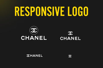
Responsive logos design is considered responsive if it is able to deliver the same experience from a brand regardless of whether it's logging on to their website from a desktop or a smartphone. Just like responsive websites, a responsive logo can scale to suit the needs of any screen.
Today, learn what a responsive logo is why they're so important. Now you can generate awesome and effective responsive designs as a graphic designer. So I'm going to be dishing out some very important and powerful information in this article.
Recent data shows there are currently over 4 billion Internet users worldwide and a whopping 48.2% of those users access internet on their smartphones or mobile devices. Now, if a company doesn't take mobile users into account, they are then ignoring almost half of their consumer base, which is, of course a very silly thing to do from a business standpoint. And this is where responsive logo designs come into play.

Now, remember, half of the world is surfing the net on smartphones these days, so an overly detailed and non scalable logo is going to look like a mess on a smaller screen. As a designer, there are a few intelligent techniques to get around this,
First think about the whole idea of logo design or brand identity. What is the goal of a brand design. It is a tool that companies utilize to communicate with their consumer and a method for meaning in the minds of the people. And this is done so that people can eventually part to their money. That's pretty much all it is.
So, with the responsive logo, you can show the brand identity is maintained regardless of the consumer's interaction with the company.
Responsive logos give the consumer a way to maintain visual consistency in any environment. And as we should all know, Consistency is critical to developing a brand and customer loyalty.
So now you know what a responsive logo is and why it's important.
How to make responsive logo?
So here are some crucial tips to keep in mind. It might be a great idea to design several versions of your logo. Once you've landed on the final concept for the client, you can maybe design the logo in two to four different variations. And this is so that they can be applied in different situations.
Different Logo variations
To notorious examples of this are firstly the English Premier League Football Association, which when the rebranded ended up with a logo mark, and then several different variations of the logo type.

Another good example is Nike, and how they can either just use the swoosh logo mark will couple it with the brand name Nike or just their tagline just do it.

This means a brand identity is versatile, and it can be applied anywhere the brand sees fit. It is important to discuss all of this with your clients and to offer the funnel design in variations of use. This is a hallmark of a very competent and professional logo designer.
Simplify
One easy way to simplify a logo design properly is by examining the brand mark and removing anything that's not necessary. Determining which parts of your logo are most likely to capture customer attention, and then remind people of the unique elements of the brand.
An example of this would be Kodak. Now if you notice over the years, they've gone from a very overly complicated and messy layout down through a refinement process until they end up with a single flat symbol.

Now another good tip for creating responsive designs is to implement vertical stacking. Vertical stacking is a common method in graphic design where creative experts want to place more content into a smaller square space. This is opposed to spreading a logo out across a horizontal plane. The idea is to pull everything together into an imaginary box. This is obviously more optimized for smartphones.
This is the digital age of transformation. And that means that more companies of all shapes and sizes are going to need to learn how to create responsive logos in the years to come. Some experts actually believe that the majority of browsing customers will just be using their smartphones in the future. That means a responsive logos might become more recognizable than the standard brand marks we see today.
If you’re looking for more resources regarding brand design, check out these articles:
- 8 Pro Tips To Create Brand Guidelines Without Losing Time
- How to Write a Mission Statement With Examples
- 5 Branding Books That will kick your branding knowledge to a whole new level
- 5 Things You Should Know Before Start Designing Brand Guidelines
- 26 Best Free Branding Design Resources
- What's Definitive Brand Guidelines Must Include
- 17 Famous Brand Guidelines Examples That Can Inspire You
- Brand Guidelines Library
